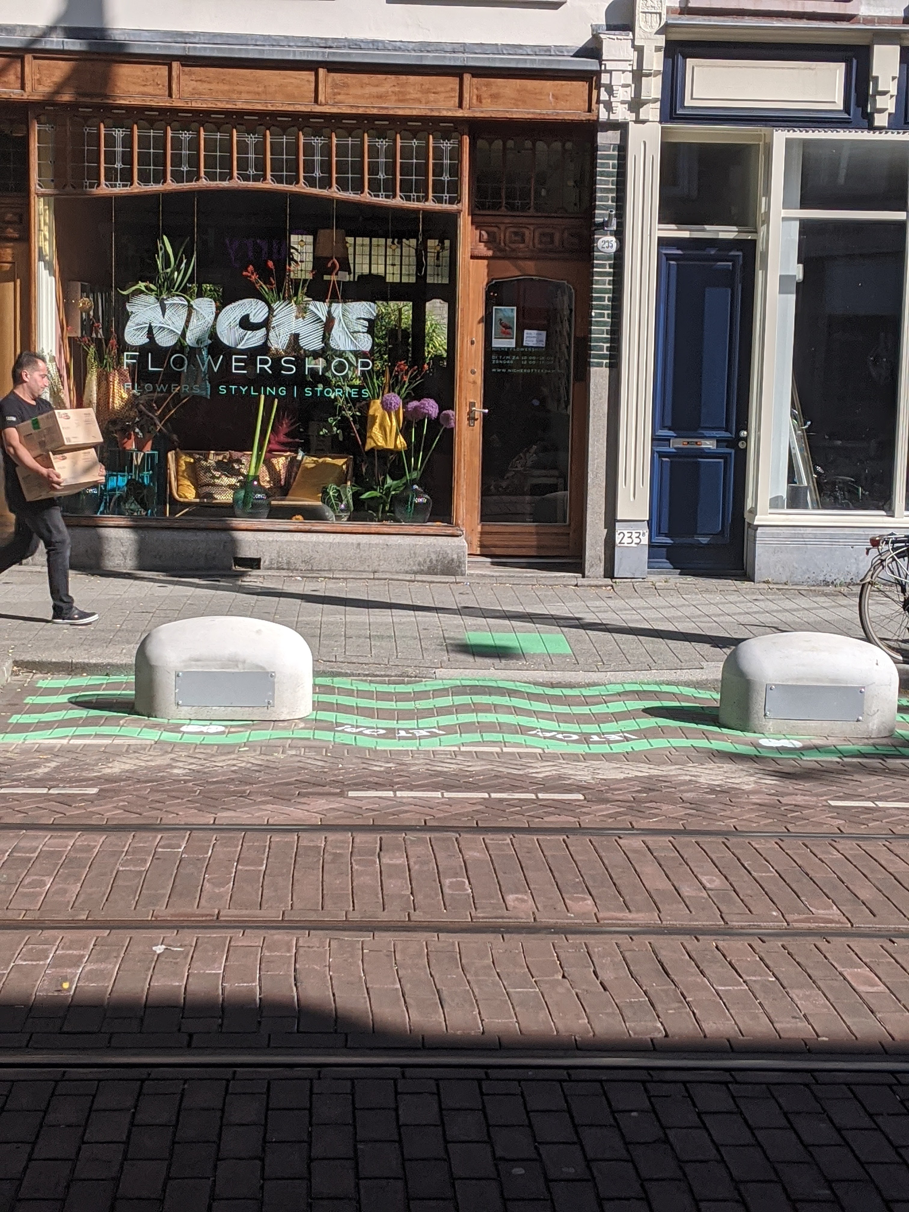
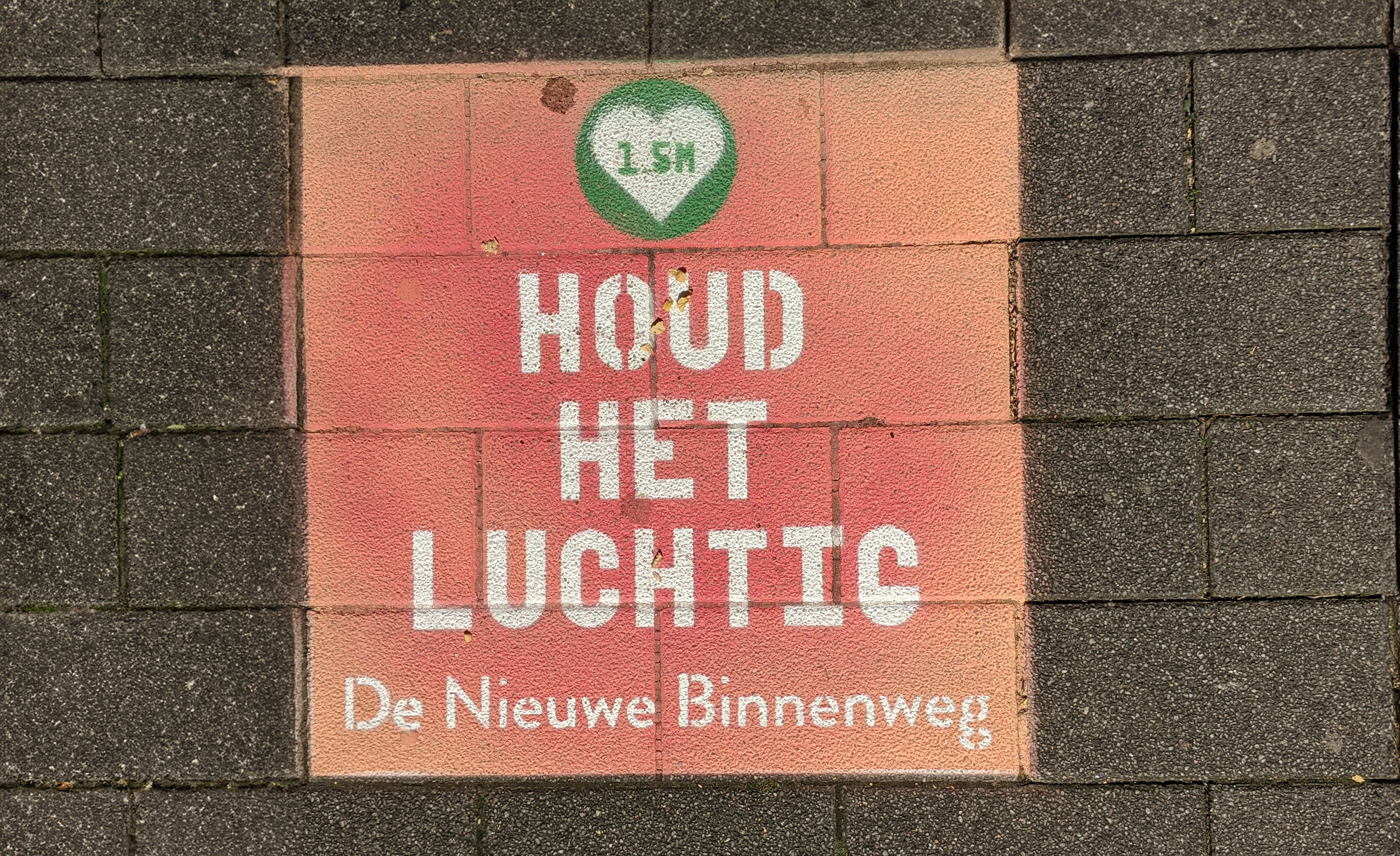
Houd ‘t Luchtig Campaign
As part of the Houd 't Luchtig campaign, the municipality—working with local businesses, residents, and theatre students — is bringing a light and creative reminder to keep 1.5 metres distance on the Nieuwe Binnenweg, a bustling and lively street in Rotterdam. During the pandemic in 2020, it was advised to keep a safe, physical distance from one another, to help limit the spread of COVID-19. With pavement chalk and playful signs, passers-by are gently encouraged to keep their distance.
Extra pedestrian crossings and one-way walking routes marked with arrows help everyone move safely through the street.


Solar Radiation Modification Youth Watch
Brand identity for the Youth Voices of Carnegie Governance Climate Council (C2G). SRM Youth Watch is a youth-led initiative that emerged from a year-long series of activities within the Youth Voices for Emerging Climate Governance project, where they learnt about solar radiation modification (SRM) from world-renowned scientists, civil society leaders and policymakers. We also engaged in several outreach activities, including organising events, participating in SRM fieldwork and workshops, and writing policy briefs.


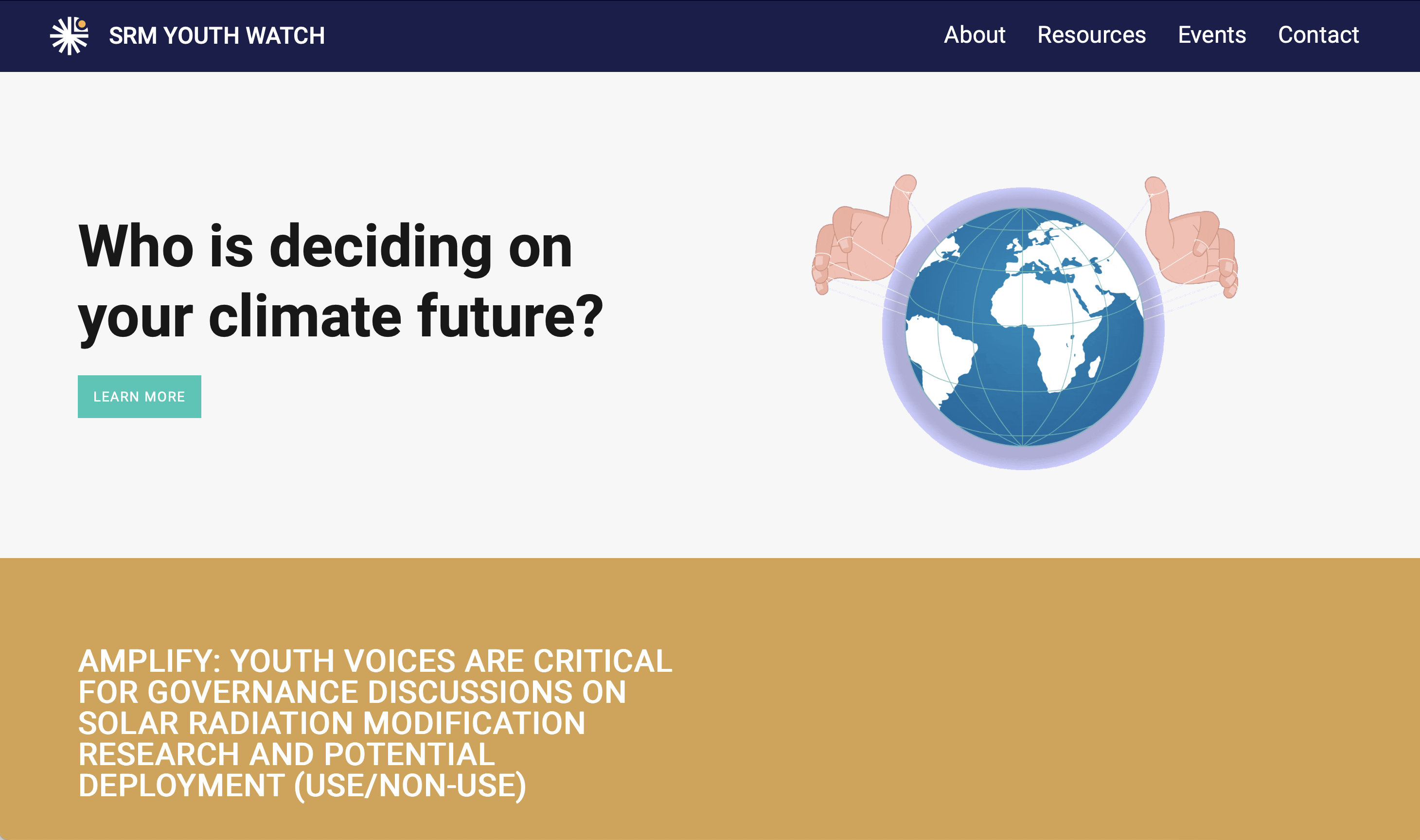
Branding / Website design
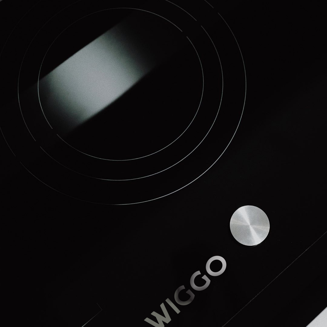
WIGGO
Rebranding for WIGGO, a Dutch brand company producing and distributing kitchen appliances in Europe, focusing on online sales in the Netherlands, Belgium and Germany, and wholesale in Europe with distributors.
Branding / Visual identity


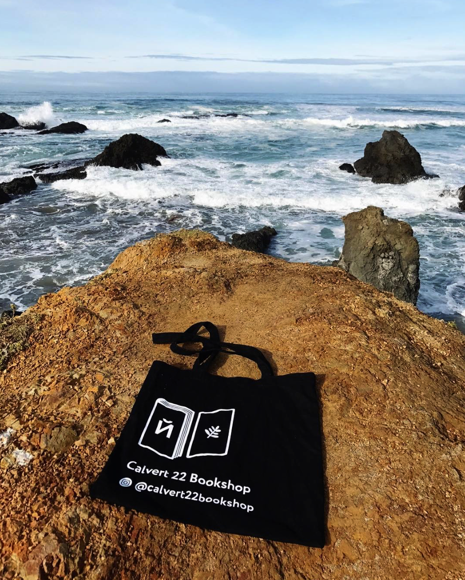
Calvert22 Bookshop
Calvert22’s bookshop and cafe hosts a curated selection of publications and treats from the New East region
Branding / Visual identity


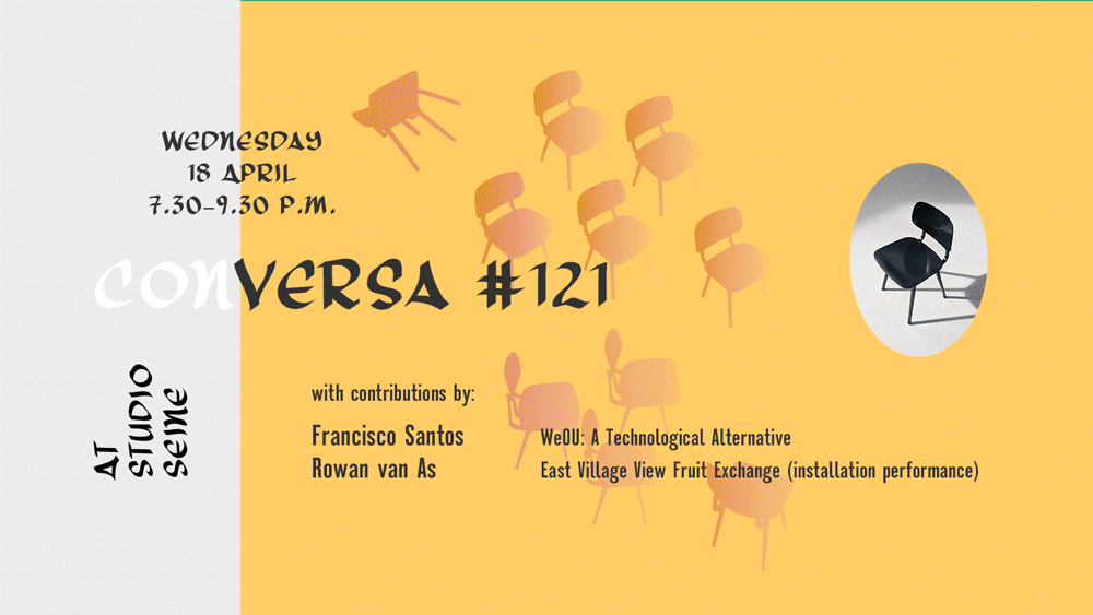
Conversas
Conversas is a series of weekly informal meetings to showcase and discuss projects and interests. During the event three Conversadores (the speakers) outlay a topic to share with the gathered group and have the floor thirty minutes each.
The idea is to have a conversation, so interaction is encouraged.
The logo and social media banners are inspired by the iconic Revolt chair of dutch design company Ahrend.
Using a recognisable design item gives some weight to the presenter and attendees as the evening depends on
interaction and indicates the set-up of the evening.
A small publication was produced at the end of the series, printed at PrintRoom with the help from the Conversas-team.
Flipbook
in collaboration with Chya Hsu who did the flip animation
Specs
Typefaces: Three Arrows and Montefiore
Paper: Munken paper
Print run: 35


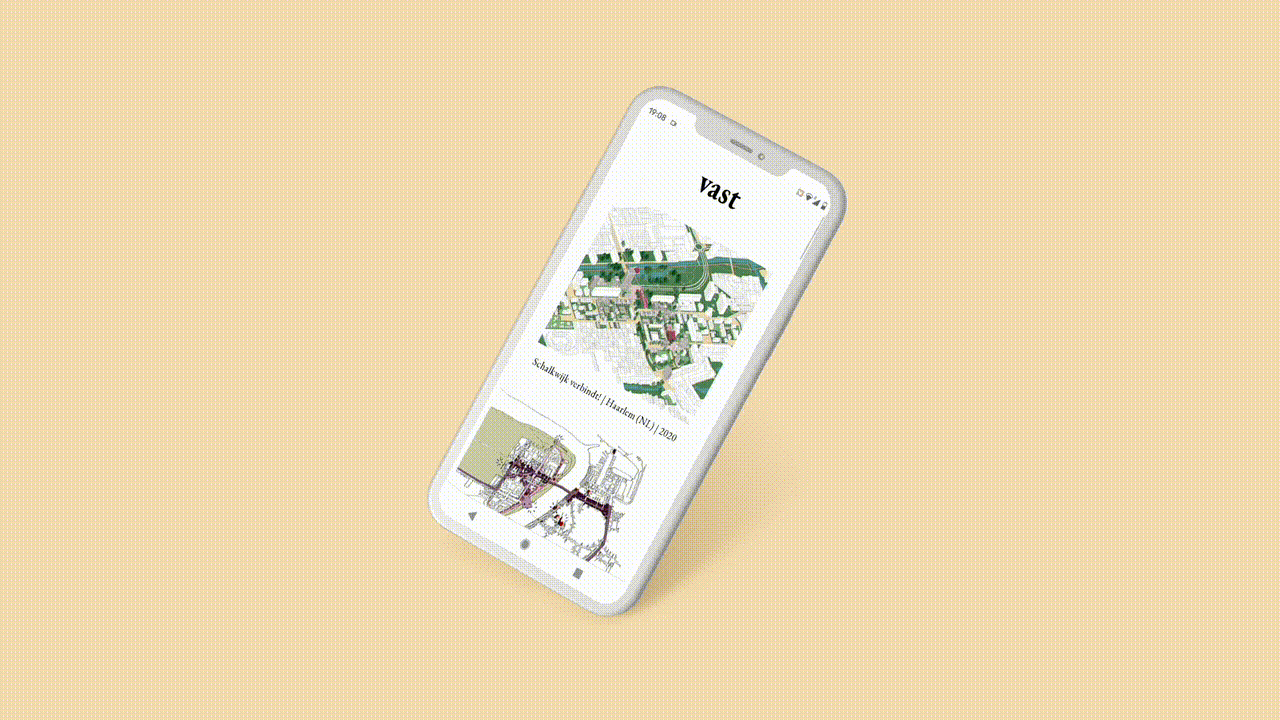
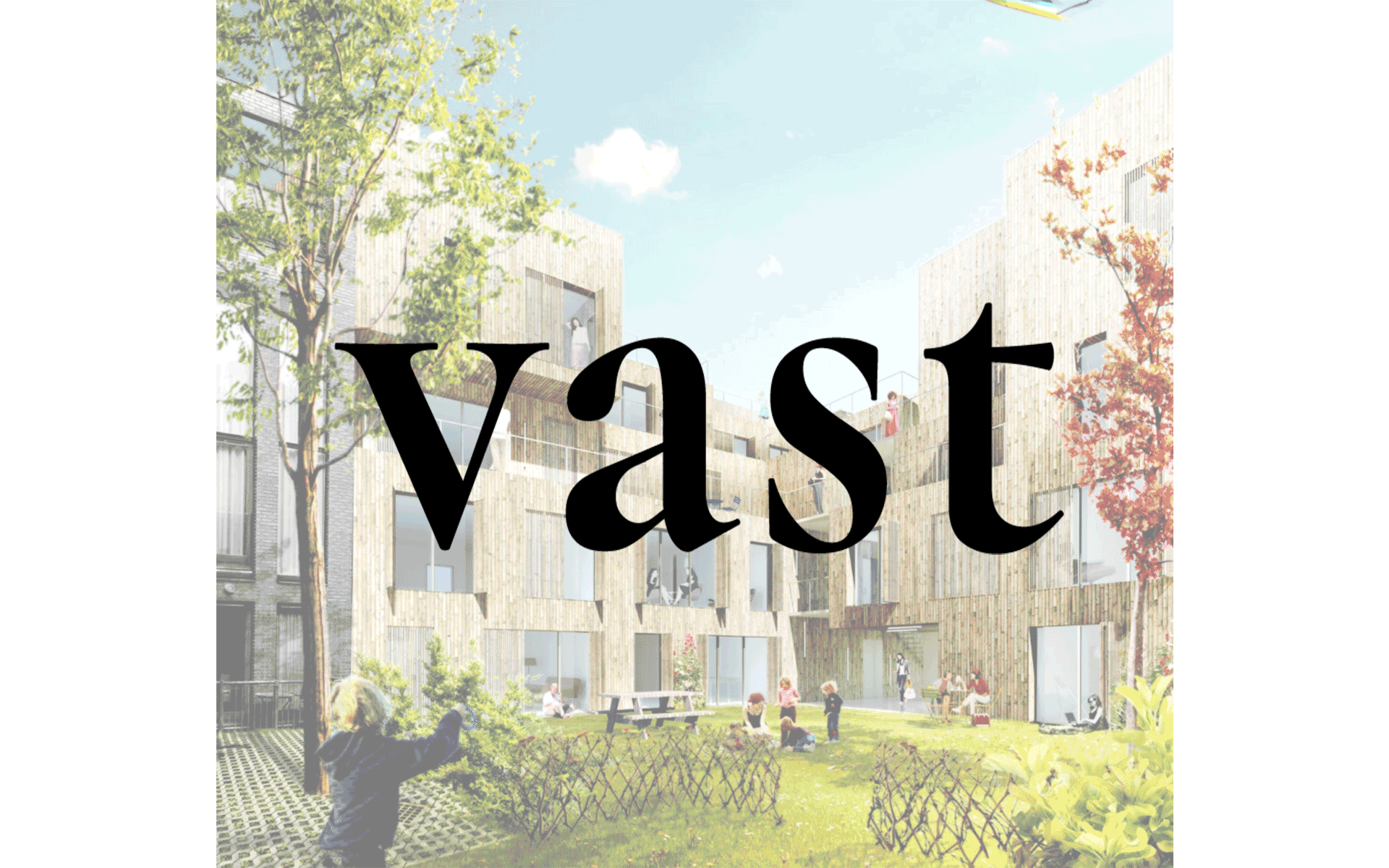
Vast architecten
Vast is a young architectural studio based in Antwerp.
Their work and fascination encompasses the built environment regardless of size, magnitude and location.
Role: Branding and website

Het Regent Tonnen
Het Regent Tonnen is a Rotterdam-based social enterprise and was initiated by Waterleider and DuzaMMM, co-organising with other sustainability projects and local governments. Het Regent tonnen offers practical, out-of-the box solutions to make our living environment more sustainable and does so in particular by implementing rainbarrels locally that help fight flooding and harvest rainwater for dry spells.
Custom logo in collaboration with Laura van der Wegen, a.k.a. @leau.irie. The core design elements are a circle to indicite circularity of HRT’s sustainibility mission, semicircles and quarter circles, geometric shapes that can endlessly form new results. Their ask was a pictoral logo and to have blue and green in it to indicate their ‘green-blue’ mission.
Apart from their new logo, we also designed HRT’s new merch and implemented our branding guidelines to revamp their website.
Font used: Nexa


